
What should a perfect website look like?
Evertise
22 Sep 2021, 15:54 GMT+10

Creating a visually attractive website that is useful for the user is a big challenge. Is there a perfect website? There is probably no such thing as an exemplary website, but there are certainly at least a few recommended practices to follow. Below we pay attention to several elements relating to both the visual and technical side.
The basis for success is minimalism, clarity, intuitiveness and a logical structure.
You could say that success is in moderation. The point is that both the text and the graphics should not be overwhelming. The user entering the website should feel that the graphic design is pleasing to the eye and simply transparent. It is a mistake to use a large number of animations and banners with exceptionally flashy colors.
It is worth remembering that simplicity and a clear message are really the key to success. The site must be designed in such a way that the user visiting the home page can quickly find all the necessary information. The navigation panel should lead to logically divided subpages. It should be possible to go to the relevant information in one maximum of a few clicks. Forcing the user to dig through successive subpages, most Internet users will simply get lost. Each of us would like to introduce some innovation on our website, but you have to remember that in designing websites, readability and intuitiveness are the most important. When designing a website, you have to feel the role of an internet user who visits our website for the first time. You have to answer the question what information will be crucial for him? And what elements of a website can make it perceived as better than the competition's website?
Good web design practices
Above, the basic principles to be followed have been briefly described (minimalism, clarity, intuitiveness and logical structure). However, it is time to turn these general slogans into more detailed recommendations. For this purpose, we list as many as a dozen good practices divided into two categories - frontend and backend, depending on which area they concern.
FRONTEND
Frontend is very much simplifying the part of the website that users see when entering your website (layout, graphic design, content). There is no need to convince anyone that how the website looks is extremely important from the point of view of the website user.
Consistent colors
The choice of the leading color, which plays the role of the leading theme and gives the character of the website, is one of the basic elements influencing how Internet users evaluate the graphic design. Typically, websites have a white, black or gray background. On top of that, however, they definitely need an extra color, which is the leitmotif previously mentioned. It should be remembered that the consistent colors also apply to the graphics and images that are placed on the website.
Navigation menu and footer
The intuitive navigation menu built on the basis of a logical and hierarchical structure of subpages is something that you simply cannot forget. It is true that some landing pages consist of only one page (the so-called one-page), but even they should have a menu that takes the user to a specific part of the page by scrolling the screen.
The footer is something that can be compared to the cover of a book. You just need to have it and you need to include basic information there. Don't forget to include your address details, contact details, a link to the privacy policy and a simple navigation menu. Internet users are used to the fact that these and some other basic data will always be found in the footer. By resigning from the footer, we actually reduce our credibility in the eyes of potential customers.
If you want to create a website yourself, check best website builder list
Logo
Of course, a catchy and easy-to-remember logo is another element that you need to pay attention to. A logo, like a good advertising slogan, can be remembered more than any other marketing material. However, this is a broader issue that goes far beyond the topic of website design. Returning to the topic of placing the logo on the website: we should assume that less combining means better. In other words, just keep in mind that the logo should be at the top of the page and it should be clickable.
Social media buttons
Buttons that allow you to share content on social media (or encourage likes / observations / subscriptions) is an element that encourages the user to interact. For some sites, social media can be the cornerstone of your marketing efforts.
Easily accessible contact details
Highlighting the contact data by placing the contact button in the upper right corner (choosing this place will greatly affect the intuitiveness). In addition, contact details can be placed in the footer.
If we want to encourage the user to contact us even more, we can try less standard forms of contact, such as a chat window or a pop-up encouraging him to leave an e-mail address / telephone number. However, one must remember that the forms of contact should not be too intrusive.
It is worth taking care of a simple contact form. Too many fields to fill may negatively affect the user's willingness to send the message.
Social media is as important as the website. When running a company, it is also worth having Instagram. Check the how to get verified on Instagram guide
Utility
Website functionality is the basis of broadly understood usability. We expect different functionalities on the business card side, other on the advertisement side, and still others when we run a blog. You must know that before all functionalities see the light of day, they must undergo a series of tests.
We especially recommend that you pay attention to the distinctive buttons, which clearly convey what action they encourage the user to do (call to action buttons). This can be, for example, the button "Contact", "Buy now", "View more", Quote a project, etc.
Speaking of usability, one cannot ignore the currently popular definition of UX (user experience). This term refers to the experience the user experiences when using the website. We mean mainly the interaction between the user and the website. A product in the form of a website should simply be attractive to the user so that the use of the dream website would be pleasant and satisfying.
 Share
Share
 Tweet
Tweet
 Share
Share
 Flip
Flip
 Email
Email
Subscribe and Follow
Get a daily dose of Austin Globe news through our daily email, its complimentary and keeps you fully up to date with world and business news as well.
News RELEASES
Publish news of your business, community or sports group, personnel appointments, major event and more by submitting a news release to Austin Globe.
More InformationBP appoints ex-Shell finance chief Simon Henry to board

LONDON, U.K.: This week, BP appointed Simon Henry, former Shell finance chief, to its board as a non-executive director effective September...
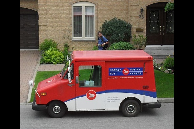
FedEx, UPS step up as Canada Post loses market share in strikes
OTTAWA, Canada: With Canada Post struggling to maintain operations amid labour unrest, rivals like FedEx and UPS are stepping in to...
U.S. stocks steady Tuesday despite tariffs turmoil

NEW YORK, New York - U.S. and global markets showed a mixed performance in Tuesday's trading session, with some indices edging higher...
Beijing blamed for covert disinformation on French fighter jet Rafale

PARIS, France: French military and intelligence officials have accused China of orchestrating a covert campaign to damage the reputation...
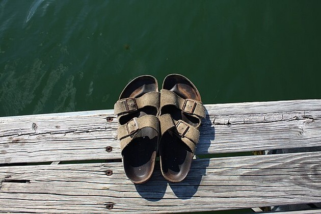
Birkenstock steps up legal battle over fakes in India
NEW DELHI, India: Birkenstock is stepping up its efforts to protect its iconic sandals in India, as local legal representatives conducted...
Beijing hits back at EU with medical device import curbs

HONG KONG: China has fired back at the European Union in an escalating trade dispute by imposing new restrictions on medical device...
U.S. Treasury Secretary says Musk should steer clear of politics

WASHINGTON, D.C.: Elon Musk's entry into the political arena is drawing pushback from top U.S. officials and investors, as his decision...
Cam Schlittler to make MLB debut for Yankees in start vs. Mariners

(Photo credit: Steven Bisig-Imagn Images) After a week of angst that saw them fall out of first place in the American League East,...
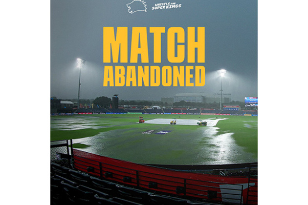
MLC 2025: Qualifier 1 washed out; Washington Freedom advance to final on points table advantage
Grand Prairie [Texas], July 9 (ANI): In an unfortunate turn of events, Qualifier 1 of the 2025 edition of Major League Cricket (MLC)...
Blue Jays strike early, top White Sox to win 10th straight

(Photo credit: Kamil Krzaczynski-Imagn Images) Vladimir Guerrero Jr. had two hits and two RBIs, Davis Schneider homered and Chris...
Report: Wizards flip Kelly Olynyk to Spurs for players, pick

(Photo credit: Wendell Cruz-Imagn Images) Washington and Kelly Olynyk barely got to know one another, as the Wizards dealt the newly...
LAFC look to climb standings, beginning with visit from Rapids

(Photo credit: Nathan Ray Seebeck-Imagn Images) Los Angeles FC has played just 17 matches this season while all six teams ahead of...